Wednesday, March 27, 2013

Inspiration for small bathrooms


Since people seem to become more and more interested in smaller homes, whether for downsizing reasons, keeping utility costs low, etc., it's also becoming important to decorate your space in a way that maximizes your square footage.  As my fiance and I are looking at homes, all of which are teeny tiny (about 2 bedroom, and 1 full bath), we've noticed clever ways some people are putting all the amenities of a full bath into what was traditionally the powder room.  These small, full-amenity baths, or Cloakroom suites, as they're referred to in the UK have become an increasingly popular bathroom trend in recent years, with more and more people keen to create a smaller second bathroom.


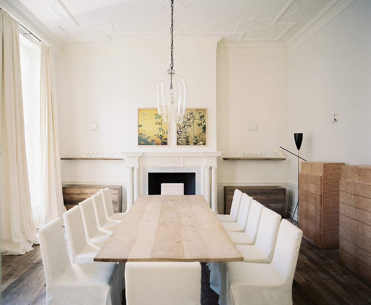
Keep in mind it's not actually light colors that make a space look larger - it's a lack of contrast that keeps a space looking airy...


There are a number of techniques available to ensure that you do not have to sacrifice the luxuriousness of your bathroom due to the lack of space on offer. Many of these choices revolve around bathing options, with shower baths a particularly popular option for those with a smaller bathroom.

A shower bath ensures that every bathing option remains available to you, while freeing up enough space in the suite for other essentials such as the toilet and a bathroom basin. There are several different choices of shower baths available, meaning you can be sure that your shower bath matches the overall style of your bathroom suite.


This tub is narrow, but deep (which I think is actually better than the shallow, wide tub most of us have...), and it saves space!


I am an avid bath taker, so I can't imagine only having a shower.  Even if it meant my toilet would only have an inch between the sides of it and the sides of the tub!

If you are planning on a small downstairs bathroom, cloakroom suites could be the ideal choice. A cloakroom suite is a bathroom significantly reduced in size, usually containing only the absolute essentials. While you would not usually include any form of bathing option in a cloakroom suite, they can ensure that your main bathroom is left free, ideal for busy households where several people live together.

A cloakroom suite is also ideal if you often have guests over, providing them with access to a bathroom without the need for them to feel like they are intruding by venturing upstairs. Cloakroom suites are therefore the ideal accompaniment to your main bathroom, with many extremely helpful functions.

Not only does this small bathroom have a shower, it also has a mini soaking tub!

In addition to a shower bath, a corner bath can also help to save a great deal of space within a bathroom. By dedicating your bath to a single corner of the bathroom, a significant amount of space is saved and can be filled with additional bathroom necessities. As with shower baths, these corner baths come in a range of different styles and designs, meaning the overall theme of your bathroom will not be impacted.

Bathroom furniture can also help to create the illusion of space and prevent your bathroom from appearing cluttered and untidy. As well as covering up unsightly pipework which may be present, this bathroom furniture also creates a great deal of additional storage space. This can be used to store deodorants, shower gel, makeup and the various other items which are traditionally stored within the bathroom.

Wall hung toilets are another way to maximise the space in the bathroom, especially when combined with the above recommendations. With these aforementioned techniques and many more, it is no wonder that the popularity of small bathrooms continues to expand. Whether you are replacing a small bathroom or are contemplating the creation of a cloakroom suite, there are a number of trends which can be employed to ensure that the result is not only functional, but extremely aesthetically pleasing.

1,2,3,6 Houzz, 4,5 Fresh Home

disclosure: this post in partnership with screwfixbathrooms.com

Tuesday, March 26, 2013

Bedrooms from glamorous to sweet

It snowed yesterday in Maryland. snowed! {displeased face}


Such a gorgeous balance of glamor and ease.


gold+ aqua+peach=♥


Too much red and pink for me, but a younger me would have woken up smiling every morning!

Perfect pretty spot for little ones to read...


So maybe not a bedroom, but still a beautiful place to dream.

1,2 via This Is Glamorous, 3,4,5,7 Sweet Home Style, 6 Roco Mag

Thursday, March 21, 2013

Quietly stunning: Dining rooms with glowing repose

I've been having a huge dining room crush lately, and I think it's because I don't have one, and it's not likely that our first home will have one either. These dining rooms also reflect the style I've been loving lately - not too shabby, not too chic, but a lovely mix of clean, sensible design with a touch or two of glamor.
This dining room is quiet and peaceful, but the pink sofa adds a little wink.

A sunny spot to eat breakfast is the best!


I want those chairs so bad!!! Anyone know of something similar thats affordable?

The white "leather" bench is actually faux leather vinyl - great for kids (or me!).  This owner recommends Grain de Cuir by Nobillis.


1. via BHG, 2. via Lonny, 3. via Laura Ashley Advertisement, 4. via Interiors Porn, 5. via Lonny, 6. via Southern Living.

Wednesday, March 20, 2013

How to easily mix decorating styles

Whether because you and your partner have different styles, or because you love furnishing and decor from all eras, mixing styles does not need to be a battle.  In fact, I often find transitional and mixed interiors to create the most satisfying "oooohhhhh" moments in someone's home.

There are a few guidelines to keep in mind though, when mixing styles.

A. Choose sides.  Don't give styles equal love.  If you have an equal amount of mid-century mod pieces mixed in with your Victorian antiques, the space will not look harmonious, but rather just poorly designed.  Pick one style to have more presence in your space, and use the other style for accent furnishings or accessories.


I believe the dining room above is by SFGirlByBay

3 images above via Houzz

This dining room is a perfect example of the perfect "imbalance." The room is predominately mid century modern, with what appears to be a Japanese antique buffet, and Japanese prints on the wall.

How cool is this Arne Jacobsen Egg Chair Ægget Stol in an otherwise traditional/country room?
image via Houzz
Different styles can get along!
(the tufted club chair is on sale at  Joss & Main)

B.  Change.  An unusual paint or reupholstery job can transform a drap victorian antique into a truly stunning contemporary piece.  That doesn't mean you need to go kitschy with hot-pink for the wooden legs and arms or your wingback, but a glossy coat of lacquer and a more modern, bright fabric can make more traditional pieces a wonderful addition to a room dominated by modern furniture.

image via Houzz


How gorgeous is that settee and wingback?  The modern lucite coffee table and modern lamp don't distract because they aren't fighting for attention with the traditional elements of the room.  While the picture frames are traditional in shape, the presentation and color is modern.

C. EDIT and KEEP IT SIMPLE Some adages and rules stick because the work! Too much clutter and too many knick knacks are going to have your space looking dustier and mustier than a cat lady's, no matter how beautiful your accessories and furnishings.  If you want one of your favorite antique lamps to shine, the worst thing you could do would be suffocate it with too many other accessories, especially of mixed styles.

image via Apartment Therapy

image via Apartment Therapy *disclosure: this post in partnership with Interioraddict.com

Thursday, March 14, 2013

A home makeover full of glamor and comfort!

This home has me hankering for a spa day! The luxuriousness of everything is so delicious, I could spend a whole weekend just going between the bath and the bed!

These spaces were designed by Marie Flanigan interiors, and the most fun part is seeing the HUGE difference between the before and afters! 


Of the project, Principal designer Marie Flanigan states '"this project is unique because we were able to transform their spaces without simply making them larger.  We kept our focus on architectural details, natural light, and creating cozy hideaways”. Functionality was improved, architectural beauty was enriched, and the entire home became a more fitting reflection of the chic couple that lives within. "'

The Master: 

"Adhering to our client’s desire to incorporate pre-existing antiques, many of their personal furniture pieces were preserved. Any new items were selected based on the unique charm they offered to the space. An over-scale antiqued French chandelier hangs at the end of the bed serving as both a distinctive focal point and a dramatic statement. The more contemporary items, such as the white animal hide bench, mirrored coffee table and gilded iron table lamps, offer modern lines that present an attractive contrast against the turn-of-the-century oak bedroom set. "- Marie Flanigan


One stressed out closed before...

One AHHMAZING closet after...


Master bath before:


After:

"Our designers created the impression of increased square footage by opening up the shower, lowering the bath tub and modifying the vanity." -Marie Flanigan

Before:

After:


A guest suite: 


The unique flooring is tricolored limestone mosaic

This guest suite below is my favorite, it's sooo pretty..


This before of this nook left me speechless:

The after (phew!)

Thanks to Marie Flanigan interiors for sharing this beautiful project with me!

Wednesday, March 13, 2013

A bright, white, beautiful kitchen

"Simple and white" was homeowner Julie Holloway's mantra for her kitchen renovation, and it's one I hope to have the means to adopt one day as well.  I adore white kitchens, they look so clean and bright!

Check out Julie's gorgeous Atlanta area kitchen (and some more of her gorgeous 70's home)


For some reason I have a lot of trouble finding bar stools I like, especially in a more open layout where they have to work well with the living room furnishings as well.  I think the brushed stainless steel ones look good.  What do you think?

One thing Julie manages that I don't think I could is open shelves instead of cabinets.  It would force me to get matching dish sets, which is good, but it means only I would ever be putting the dishes away, cause my sweetums wouldn't have the patience to stack everything perfectly.  He'd rather wash dishes by hand than unload the dishwasher!


I adore the dining area - everything about it - chandelier, table, mirror, shades....


Here are some shots of the rest of the house.


 At first I thought this was a home office, but now I realize that maybe that mirrored piece isn't a desk...Regardless, love the space.

Oh la la...white and dark wood - how I love thee!


Julie is co-owner (along with Anisa Darnell) of Milk and Honey Home, check it out, you'll love it.  All the images seen here belong to Milk and Honey Home, and some were featured in the Nov. 2011 issue of Better Homes and Gardens.


this post in partnership with Lakeland Furniture